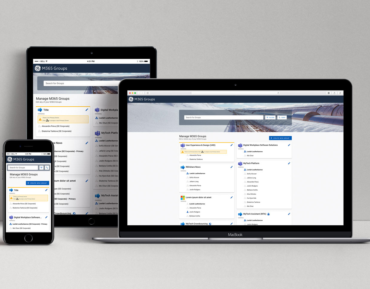
While I was a designer at GE, we built our own custom design system to ensure consistency and coherence across our products and services, enhance brand recognition, and improve user experience. By establishing standardized design principles, components, and patterns, the custom design system was able to streamline development processes, promote collaboration among teams, and ultimately result in more efficient and impactful design solutions.
The design system was first built as an open source project for designers and developers to contribute to. However, during my time as Senior Manager of UX Design at GE, I was able to get approval for dedicated resources to form a team to support the design system as an additional product in our portfolio.
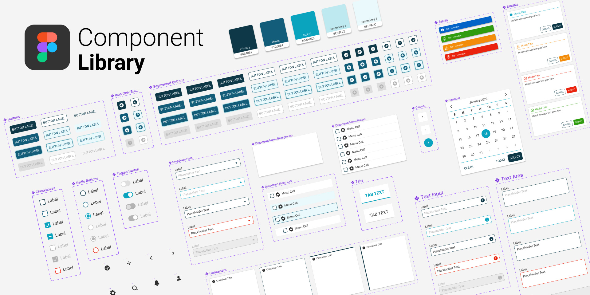
After starting my role as UX Manager at Deltek, I found that we didn't have a design system and furthermore, our designer's weren't using Figma Component Library files either. A component library file in Figma offers several benefits, including improved design consistency by providing a centralized repository of reusable components. It also enables faster design iteration and development by allowing designers and developers to collaborate seamlessly on shared components. Additionally, using a component library can enhance team efficiency by reducing duplication of work and ensuring design coherence across different projects.
As a result, I mentored and trained a team of designers in creating comprehensive component library files in Figma, resulting in improved design consistency and efficiency across projects. I have extensive experience building and maintaining component library files and it's supporting documentation in Figma. I created this design system library file as an example of what we wanted to create for our design team at Deltek and demonstrated how to use library files.
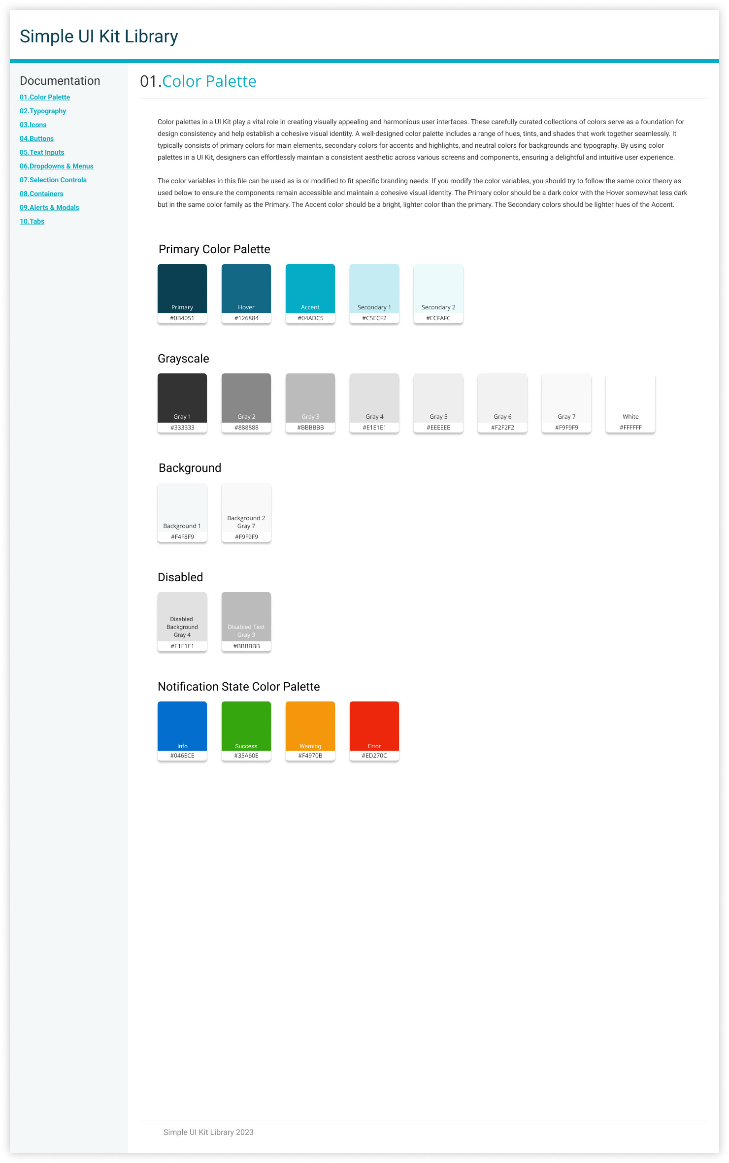
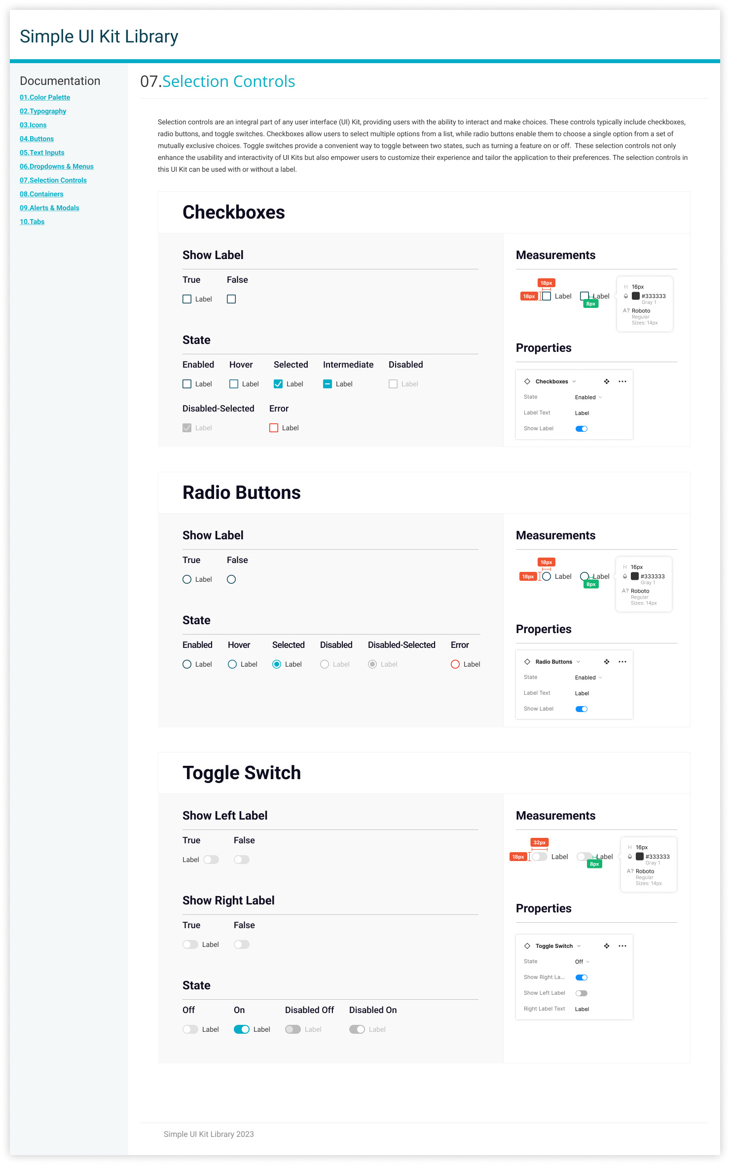
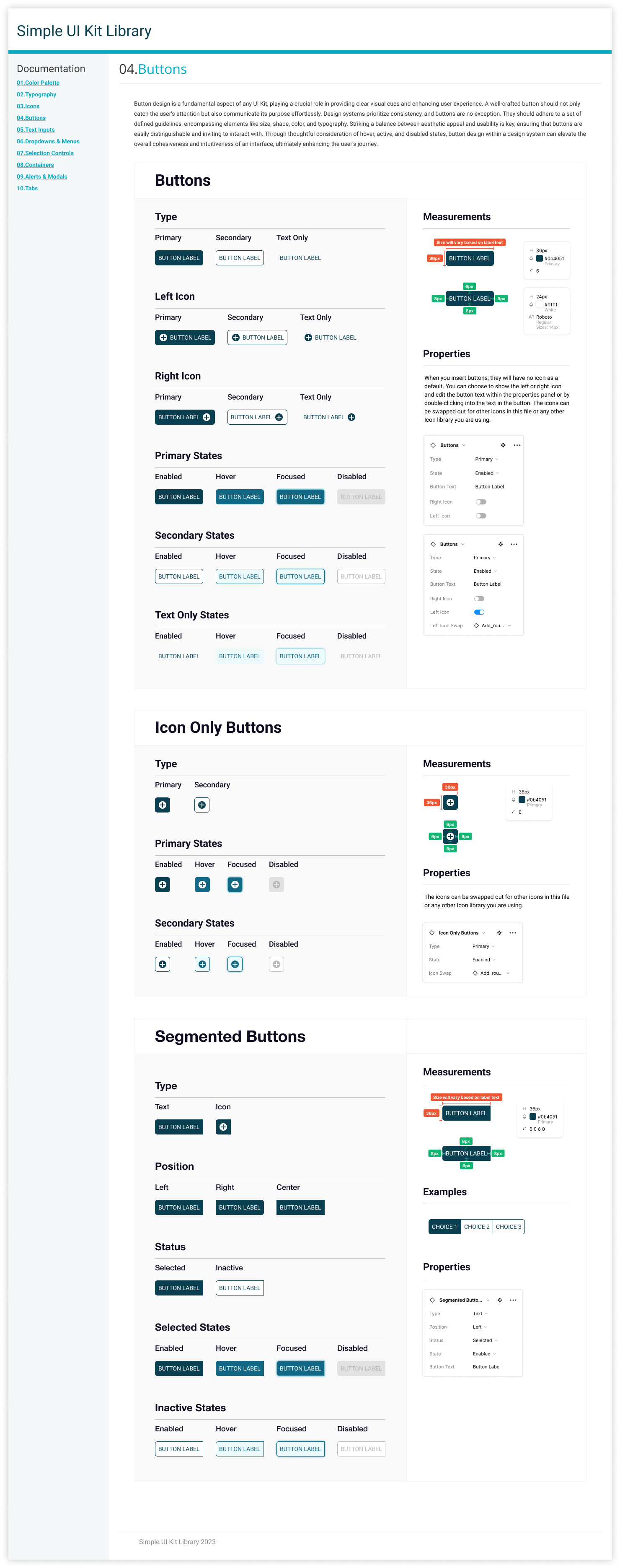
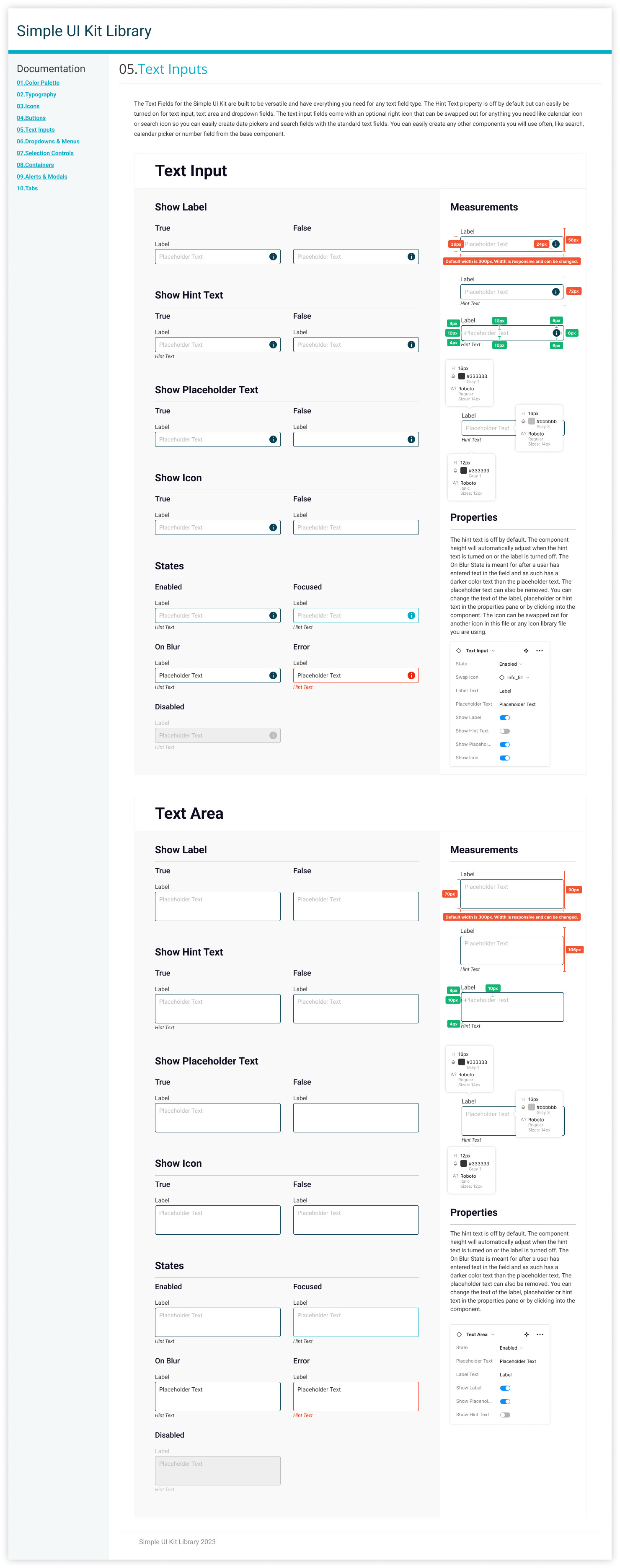
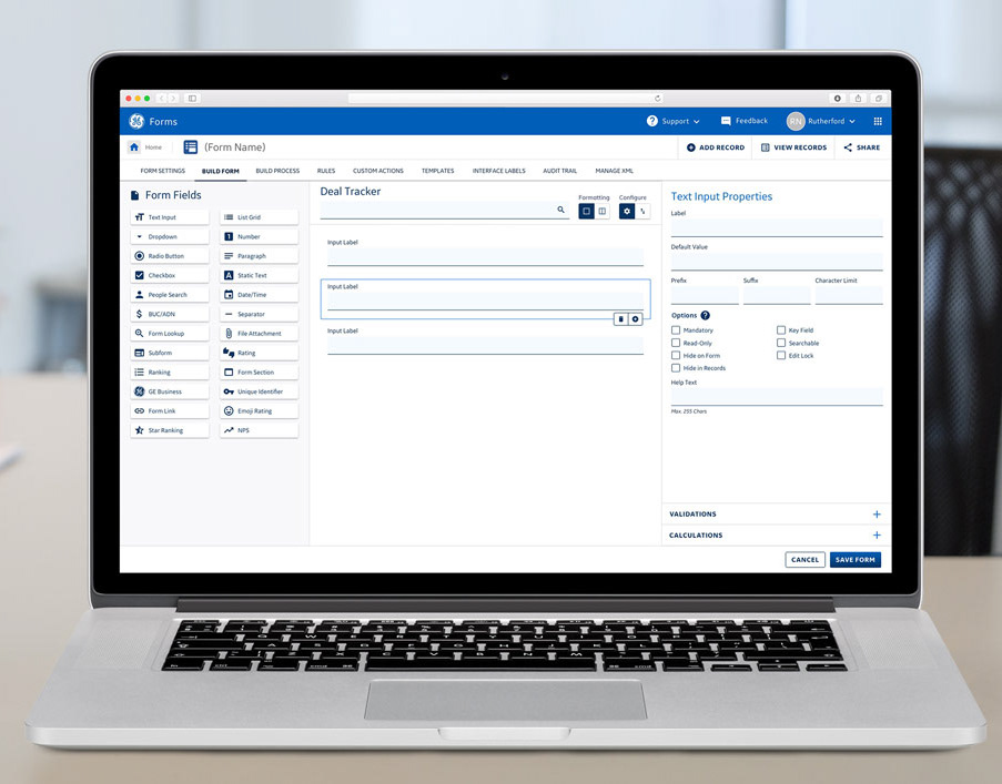
Below are a few examples of the component documentation.